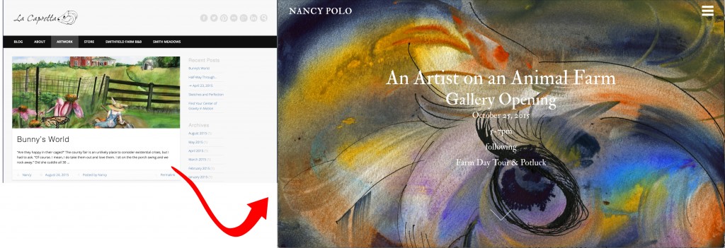
 Artists evolve and adapt. Websites need to change with them. My old site lacapretta.com no longer fits me. Rather than a studio based site intended for collaboration with other artists, I want one that presents a solo artist in a more stunning way. This is how I made the transition to nancypolo.com

1. Pick a Web Domain, Register and Host It
An artist’s name is an obvious choice, but there may be something other than a name by which you wish to be known: your studio, your biggest inspiration (bunnies!), or some other part of yourself that feels more comfortable in public. I chose my name because I’m finally presenting myself as a solo artist. To introduce yourself effectively, in a world full of distractions, pick something easy that people will remember later. My name is relatively short and easy to spell. For the scope of this post I don’t want to delve too much into the registering and hosting of a site. I spent the least amount of time on this part of my own design. For those who want to focus more on this aspect, here is a site quickly found with the search “how to purchase a domain name”. It was 4th on the list. I am no expert, and I prefer to write about the structure and content of this site. Whatever you choose to do, write stuff down somewhere you can easily access. Roladexes, although archaic, are very useful for storing user names and passwords. They don’t crash and can be read by candle light.
2. Find the easiest way to create the site
 I’m not a developer, but I like to pretend on WordPress. Even its most basic sites are varied enough to allow for creative, adaptive designs that transmit information effectively. Features include a plugin architecture and a template system. The architecture of a website is what we don’t see in an actual building: the cement foundation, the steel girders, the timber framing and the plywood sub flooring. With that analogy, the term plugin architecture might make you nervous. How do I know what to plug in? What if it gets unplugged? Will everything come crashing down? That’s why templates are important, and WordPress calls them themes. Picking the right theme is determined by answering simple questions.
- Are you simply showcasing images of your work?
- Do you blog?
- Are you going to have events you want people to attend?
- Do you have a call to action that will change on a regular basis?
- How often do you want to tinker with your website?
- Will you be selling work online?
 Although I did not use The Ultimate Guide: How to build your own artist website it is very helpful in understanding and answering the questions above. As I maintain my new site, I will probably reference this guide often.
3. Pick a theme that works
I was immediately struck by Fatima Ronquillo’s website, which was made with the Port Theme template. The first thing that appears is a beautiful painting with a very simple message in white, grey and then red letters in the center that reveal, rather than obfuscate, the art:
 Reveries
artist’s reception
Friday, August 14, 2015, 5pm – 7pm
Meyer East Gallery, Santa Fe
preview show
The red “preview show” is a link to a blog where Ronquillo’s elaborates on the work in her most recent show. It complements the red lips of the girl in her painting. Just below that is an arrow that produces the same effect as scrolling down to reveal: a categorized grid with thumbnails of works, an About the Artist section in grey and then the blog. The home page unpacks like a cleverly wrapped gift. There are no obnoxious buttons. The About the Artist part floats between and behind the rolling shades of the gallery and the blog. Subtle placement of information that compliment the images leads to a deeper look at 3 things: the work, the artist’s primary story and more stories about how her work continues to develop. There is a sliding Main Menu accessible via a three-lined button (a side menu, navigation drawer, or a hamburger) on the top right with links to the top pages.
We don’t have much in common aesthetically, however, Ronquillo’s work is presented in a way that allows the paintings to dominate the screen. If I choose to change my homepage back to a blog roll instead of the cleverly wrapped featured page, it would be easy.
4. Make the template work for you
 There is a lot of customization beyond the theme options that makes a site unique. After installing the theme, there were 3 things that stood out: font, widgets & social media links. It’s fairly easy to import the Port Theme Demo Content into the word press tool box. Here are the step by step instructions. I wanted to explore a little more, within reason, so I stuck to Getting Started with Port Theme and searching online.
 Here is what I learned. Google has a fair amount of free web fonts that can be easily inserted into the Appearance Tab under theme options. When in doubt, there is an excellent and FREE Word Press plugin for social media buttons and links. I ended up using two: Font Awesome for Menus and Add This.
 With the first I could insert simple silhouette styled buttons for connecting via social media. A basic knowledge of html was helpful in understanding how to use this plugin with a text widget added to one of the menus. It’s important to familiarize yourself with how and where to add widgets. Most of this is covered in the Getting Started with Port Theme, but some exploration to get the right effect is required. Here is the code I used to create a line of widgets in my footer menu, slide out menu and sidebar menu.

What is not readily apparent when you insert basic buttons with Font Awesome, is that the icons may not line up exactly as you want. It takes a while to study their instructions and play with different placement to get everything to align.
 Add This was much simpler. With their interface you can choose from various size icons and placements throughout your page. I recommend not overwhelming people with share buttons on every facet of your posts, pages and menus. The elegance of your site will be diminished by the cookie cutter feel of social media buttons.
These are only a few of many details. I spent a day getting a clean look, and then moved onto content.
5. Establish an Organized Group of Core Images
 I’ve been making drawings or paintings for years. There is not one portfolio. Even my most “accomplished” pieces are scattered: given to friends, claimed by family and a few bought by patrons. The value in years of work is difficult to gauge. A complete idea of what I’ve created is not clear even in my imagination. I’ve become obsessive about taking pictures of works. Blame it on a minor addiction to social media or narcissism. Either way, sifting through hundreds of images to curate a web presence is daunting. Properly tagged, captioned and organized image streams makes this much easier. Religiously posting to Flickr for 7 years allowed me to group works according to major themes.
 Choosing the best works is tricky. Anonymous statistical information can help. What are people looking at? What do they like best? What has been worth collecting in a list of their favorites or galleries? What does your own eye come back to with joy? Pick a large enough group to equally represent the chosen genres and media. The result on my site is a collection of 81 images divided by the following: media (27 acrylic, 18 graphite and 35 watercolor) and genres (21 abstract, 24 bunnies, 20 figure work, 9 landscape and 14 portraiture). Some groupings may seem unbalanced. Curation is dictated by production and response. What I continue to paint, site stats and exchanges with my viewers may change the list. Nothing is permanent.
 6. Focus on creating engaging content
Now that the site is set up to look and function smoothly, it’s all about content. Making art is one thing. Communicating about it is another. With lacapretta.com, the focus was on collaboration with other artists and building community in an isolated, rural world. With nancypolo.com there is more room to focus on what makes me unique as an artist. The blog categories are meant to reflect the intricacies of being a small business owner and artist on a farm. I write, I paint, I make and sell food, all while raising a child in a beautiful place. Perhaps one day I will be selling paintings for $20,000 in very fancy galleries. Whether or not I get there, there’s an interesting space carved out for me to tell and illustrate my story.

Leave a comment